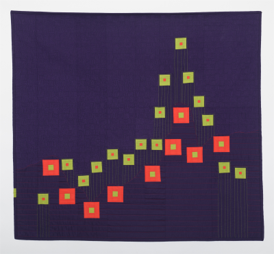
This quilt came about one day when I was watching the news as the Omicron variant was finally subsiding. At the same time the horrible, Covid-19 infection rate chart appeared on the screen I was day-dreaming about the Appalachian Trail. I spent 6 months hiking the trail in 1993 and it’s an experience that’s quite often in the front of my mind. Suddenly the infection rate chart looked like a profile map, a cross section that shows elevations. I thought I was imagining it, so I dug out my trail maps. Sure enough, when I condensed a Covid-19 infection chart and condensed the trail so their lengths matched, the two lines were similar. The red area in the foreground of the quilt is a condensed elevation map of the Appalachian Trail. The green area in the background is a chart of Covid-19 infections.